Improving VA Mobile’s App Store Experience for Veterans
Department of Veterans Affairs
Role: User Experience Designer
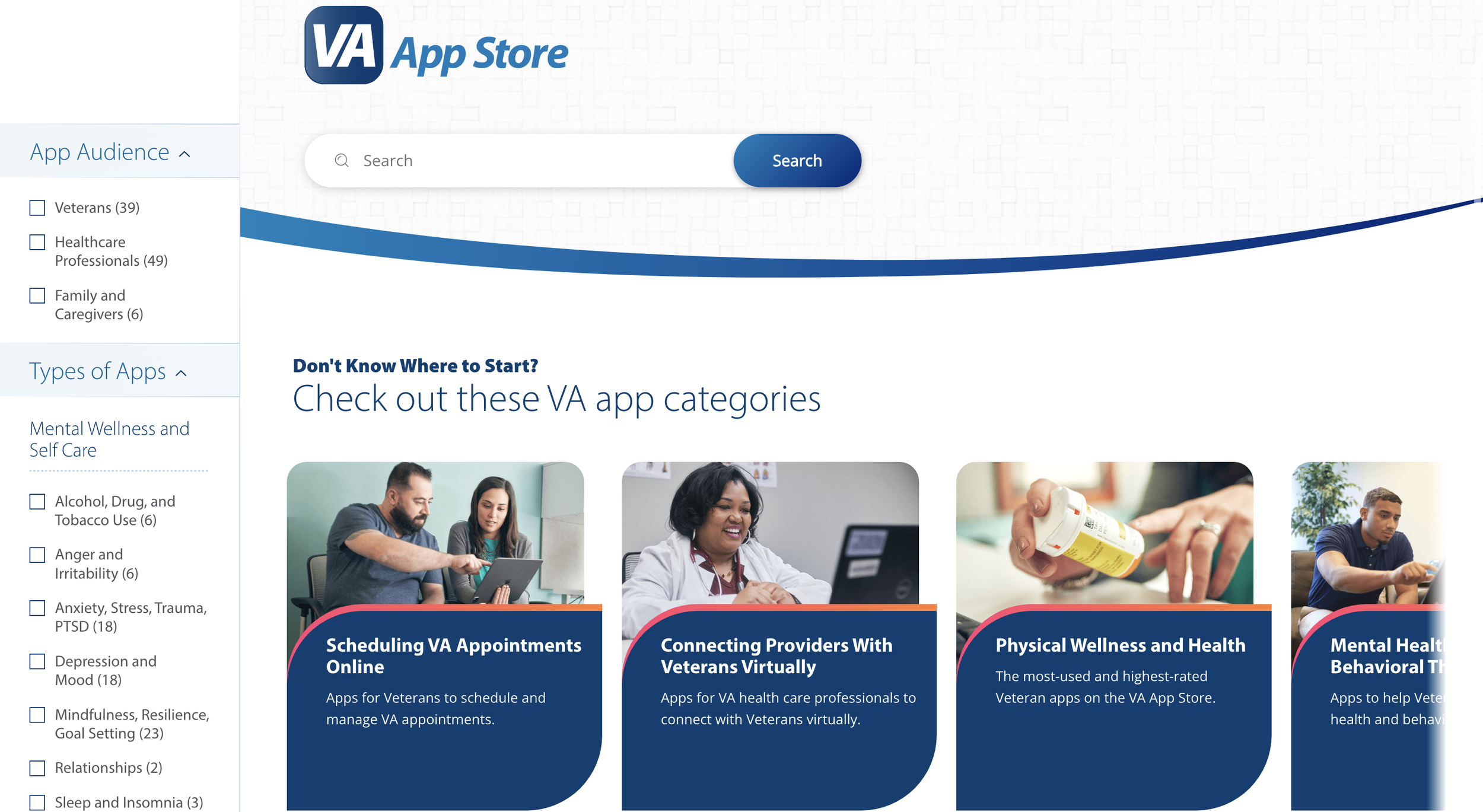
I had the opportunity to spearhead a large-scale redesign of the VA Mobile App Store, which is a transformative platform aimed at enhancing Veterans' health by providing access to innovative technologies and applications for expanded clinical care.
I led essential discovery tasks and conducted a detailed mobile app store competitive analysis. Collaborating seamlessly with content strategists and data analysts, our collective efforts ensured a holistic and informed mobile app store redesign.
Problem
The old VA Mobile website conveyed several messages at once, while not providing clear calls to action for veteran users. After conducting research, I observed that the VA Mobile app store experience was outdated and missing key features compared to other modern app stores.
Old VA Mobile HomepageProcess
Our team conducted a series of activities to identify areas of opportunity to improve the VA Mobile website experience.
Analytics Report: We reviewed VA Mobile’s Google Analytics to identify user data trends.
Heuristic Analysis: We determined how well the VA Mobile website aligned with best practices for things like site navigation, interface design, and mobile responsiveness.
Stakeholder Interviews: I conducted interviews with the website’s stakeholders to ensure alignment between the user experience and overarching business goals.
Competitive Analysis: I evaluated multiple app store experiences to help uncover any trends or UI patterns that could be applied to VA Mobile.
Competitive Analysis
I performed a competitive analysis of many different digital app stores, including VA Mobile, to identify usability issues, common UI patterns, design trends, and content structures to identify clear areas of opportunity to optimize the VA Mobile website.
Guiding Questions
Which UI patterns help foster a seamless, easy-to-use app store experience?
What kind of content is usually prioritized in the design hierarchy of app stores?
When is informational app content condensed instead of being displayed?
How do mobile experiences differ from desktop experiences?
Competitive AnalysisFindings & Recommendations
Findings
The VA Mobile site offered a wealth of app-based resources; however, the site lacked a clear identity and value proposition for its audiences.
The website did not connect visitors to the entire library of available applications as effectively as it could have.
There were several opportunities for enhanced usability, mobile responsiveness, and content design.
Application pages offered extensive directions and guidance but a lack of a consistent content hierarchy made those pages difficult for users to navigate.
Recommendations
Update the VA Mobile homepage to be more inclusive of app content by offering users an opportunity to see the breadth and depth of the app store resources.
Develop a more robust filtering system by adding specific categories for health topics that Veterans commonly face or are interested in.
Enhance the CTAs to be more engaging and visually appealing.
Create guidance for app teams that details what information is recommended for each page within an app (app description vs. training materials vs. FAQs).
Solution
The detailed competitive app store analysis I delivered was instrumental in shaping the final direction of VA Mobile's website and app store redesign. I identified critical user experience issues on the old VA Mobile website and my recommendations significantly improved the overall user experience.
My work played a pivotal role in crafting a multi-faceted, strategic, and introspective redesign that had a profound impact on the project's success.